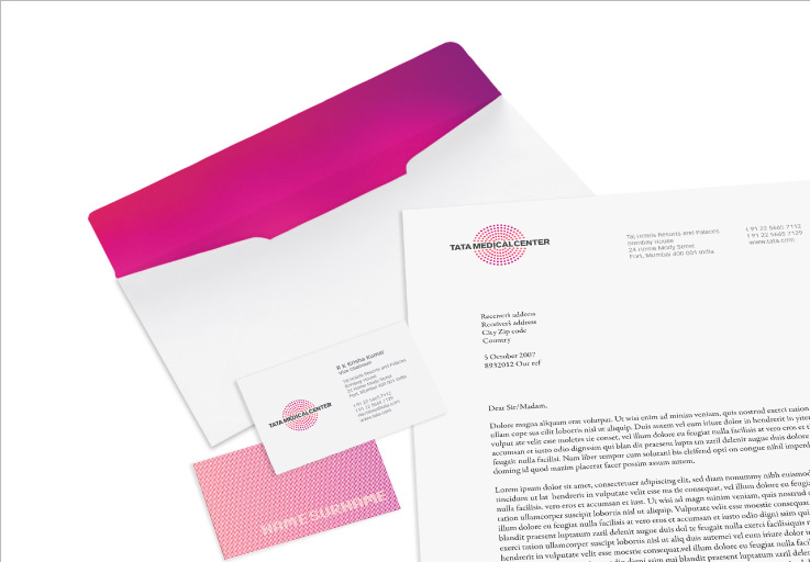
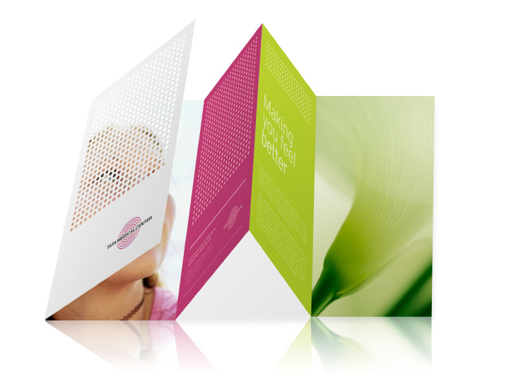
As lead and sole designer, I created a brand identity that reflects this state-of-the-art healing community with international appeal. The magenta dots represent researchers, clinicians, and patients, while the gray wordmark appears as the centrifugal force holding them all together.
![](https://sfbdesign.com/wp-content/uploads/2014/10/tatamed1.jpg)
![](https://sfbdesign.com/wp-content/uploads/2014/10/tatamed5.jpg)
![](https://sfbdesign.com/wp-content/uploads/2014/10/tatamed4.jpg)
![](https://sfbdesign.com/wp-content/uploads/2014/10/tatamed8.jpg)
![](https://sfbdesign.com/wp-content/uploads/2014/10/tatamed2.jpg)
![](https://sfbdesign.com/wp-content/uploads/2014/10/tatamed3.jpg)
![](https://sfbdesign.com/wp-content/uploads/2014/10/tatamed7.jpg)
![](https://sfbdesign.com/wp-content/uploads/2014/10/tatamed6.jpg)